Buy my art at ImageKind.com.

Saturday, September 28, 2013

Keep A-Knockin' but You Can't Come In

Sometimes when I'm walking around, a particularly beautiful and/or vibrant door catches my attention, and every so often I'm lucky enough to have a camera on me when it happens. I'm not sure what it is that appeals to me about unique doors--perhaps just the idea that something so functional and generally mundane can also be beautiful and interesting. Below is a small selection of my favorites.


Wednesday, July 17, 2013

Tree-Hugging

I've been enjoying some beautiful evening walks in the sunshine recently, listening to the rustling of the leaves in the trees in the cool summer breeze, and I've had ample opportunity to appreciate the lush greenery. I love the way the trees change with the seasons, and they completely shape the mood of my walks.


Warsaw, Poland


Cambridge, England


Cambridge, England


Cambridge, England


Cambridge, England

This one looked to me like some kind of strange serpentine creature


Silver Falls, Oregon, US


Thunderbird Falls, AK, US


Malham, England


Volta Region, Ghana

This is the view from inside a tree--this kind of tree surrounds and draws nutrients from another tree, eventually killing the tree and resulting in this hollowed-out interior.


Cambridge, England


Cambridge, England


Utrecht, Netherlands


McHugh Creek Overlooking the Inlet, AK, US


So, what do you think? In the mood to go out and hug a tree yet?

Tuesday, July 2, 2013

Lovely Landscapes?

As I gather photos for the July edition of the Guardian's Been There photo competition, I find myself once again contemplating how to avoid cliched images and stand out from the heap of submissions the contest must receive--and standing out is particularly tricky, since the contest is open to professional photographers. They've recently revamped the submission policy, so it's now possible to see my competitors' submissions. The submissions range from lackluster to quite beautiful, and in scrolling through the images that have already been uploaded, I can see a few key commonalities among the images that stand out to me.

The first factor that draws my eye is light. Of course exposure matters, but I'm referring here more to the subject of the photo than to its technical merits. Particularly in photos featuring skyscapes, my eye is automatically drawn to photos which feature bursts of light--especially when the light highlights an interesting feature of the landscape or conveys motion, as in photos of clouds with sunbeams bursting through. The second factor is foreground vs. background--photos with some depth (often but not always those which follow the rule of thirds or incorporate leading lines) catch my eye more frequently; photos in which the foreground and background are indistinguishable seem flat and uninteresting to me for the most part. The final common element in the photos that appealed to me was the successful inclusion of objects of interest. A strategically placed person or object can draw your eye to an interesting part of the photo or create a sense of motion.

So, after thinking about these principles and scrolling through my own insanely large collection of photos, I've narrowed my options down to the following contenders. Which one would you pick? Do you have strong feelings one way or the other about any of these? I have until July 24th to pick my entry, and I'd love to get your thoughts. Remember, you can click on any photo in the blog to see it enlarged. Thanks in advance for the feedback! Oh, and for those who read my last post, I checked in with the judges and yes, panoramas are allowed.


Option 1: Kenai Peninsula, Alaska

Option 2: Cape Horn, Washington

Option 3: Eklutna Lake, Alaska


Option 4: Kenai Peninsula, Alaska


Option 5: View from Flattop, Alaska


Option 6: Florence, Italy


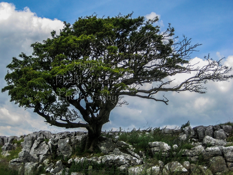
Option 7: Malham, England


Option 8: Volta Region, Ghana

Option 9: Stanley Lake, Idaho


Saturday, June 29, 2013

Is the World Black and White?

I've always loved black and white photography, but I can't count how many people have expressed a preference for color photos to me--especially for things like portraits and wedding photography. Certainly there are photos in which color is arguably the subject of the photo, and something would be missing from the photo if it were presented in greyscale. Still, I love what tossing out the color can do to a photo, especially with portraits, where I think a monochromatic treatment can really even out skin tone, or in photos on very grey days, where the colors have been a bit washed out.

Below are sets of some of my photos with the color version and at least one monochromatic treatment. There are a few I think work better or at least as well in the color and monochrome versions, but most of them are photos which I think were improved by throwing out the color. What do you think? You can see larger versions of the photos in the photo viewer by clicking on any of the photos in the post.


Heidelberg, Germany


Northwestern Glacier, Alaska


 Pine Cone in Paris, France


Wedding, Anchorage, Alaska


Paris, France


Portraits


Florence, Italy